H2O Plus
e-commerce site
Continuously evolving a brand to stay relevant and raising the quality to compete with prestige brands
Roles: Visual Design, Front-End Development, Photography
Tools: Photoshop, Html, CSS, JavaScript, jQuery
Platforms: MarketLive

Growing & Evolving with a Brand Online
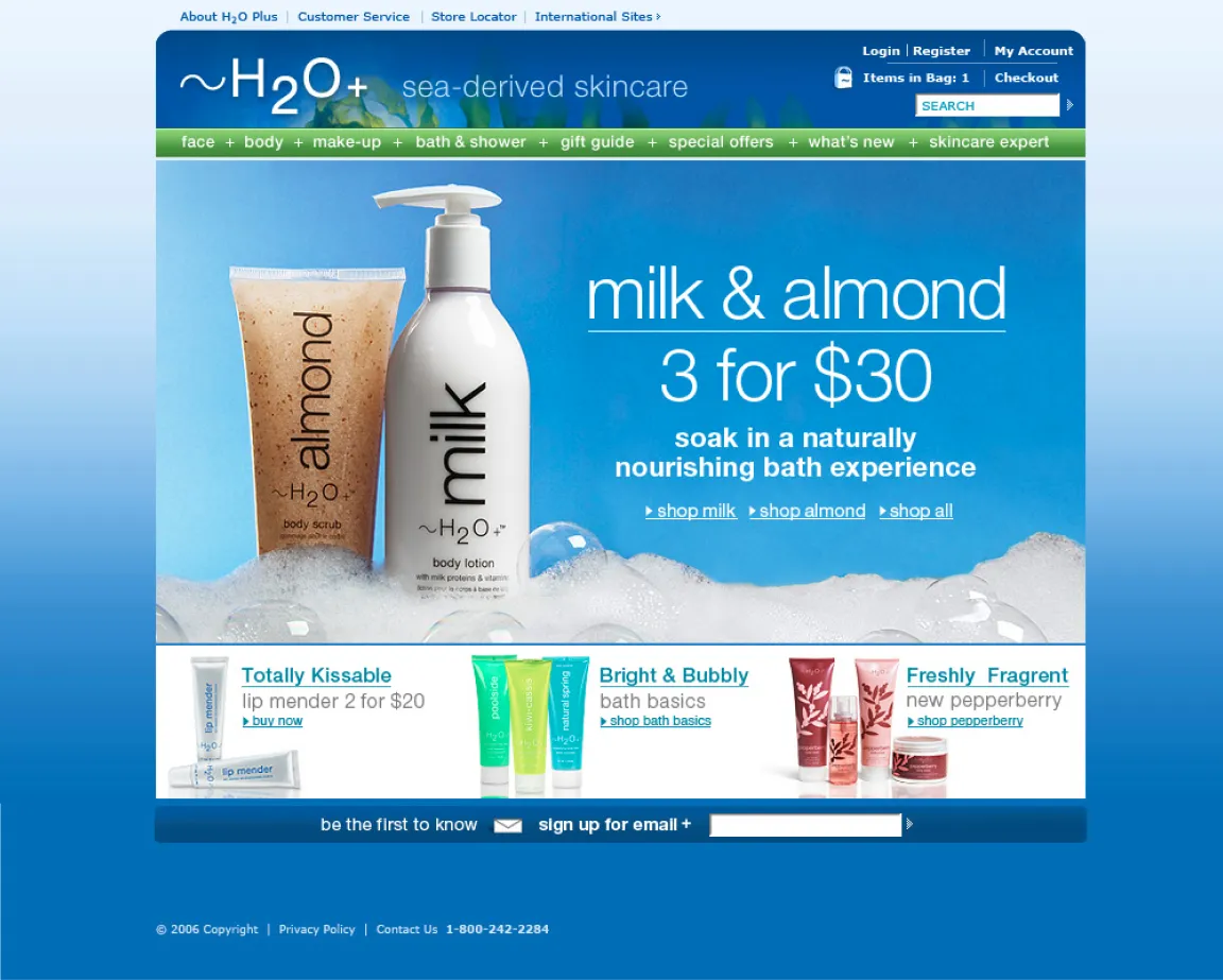
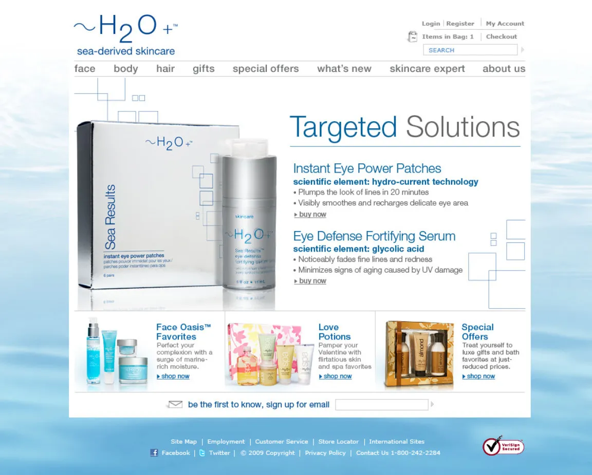
For eight years as the in-house web designer at H2O Plus I grew along with the brand. As design trends, marketing techniques and technologies grew, as well as changes in the beauty market I grew and evolved with them, always raising bar and embracing new challenges every day.
The latest site visual update. The intention was to lighten the visual feel of the site. After the last rebranding the focus was on deep sea ingredients and water. This was too heavy for the water. Also the previous website template relied to much on keeping all content above the fold.
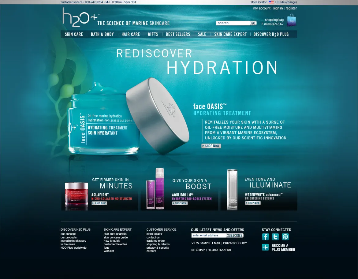
The latest site visual update. The intention was to lighten the visual feel of the site. After the last rebranding the focus was on deep sea ingredients and water. This was too heavy for the water. Also the previous website template relied to much on keeping all content above the fold.
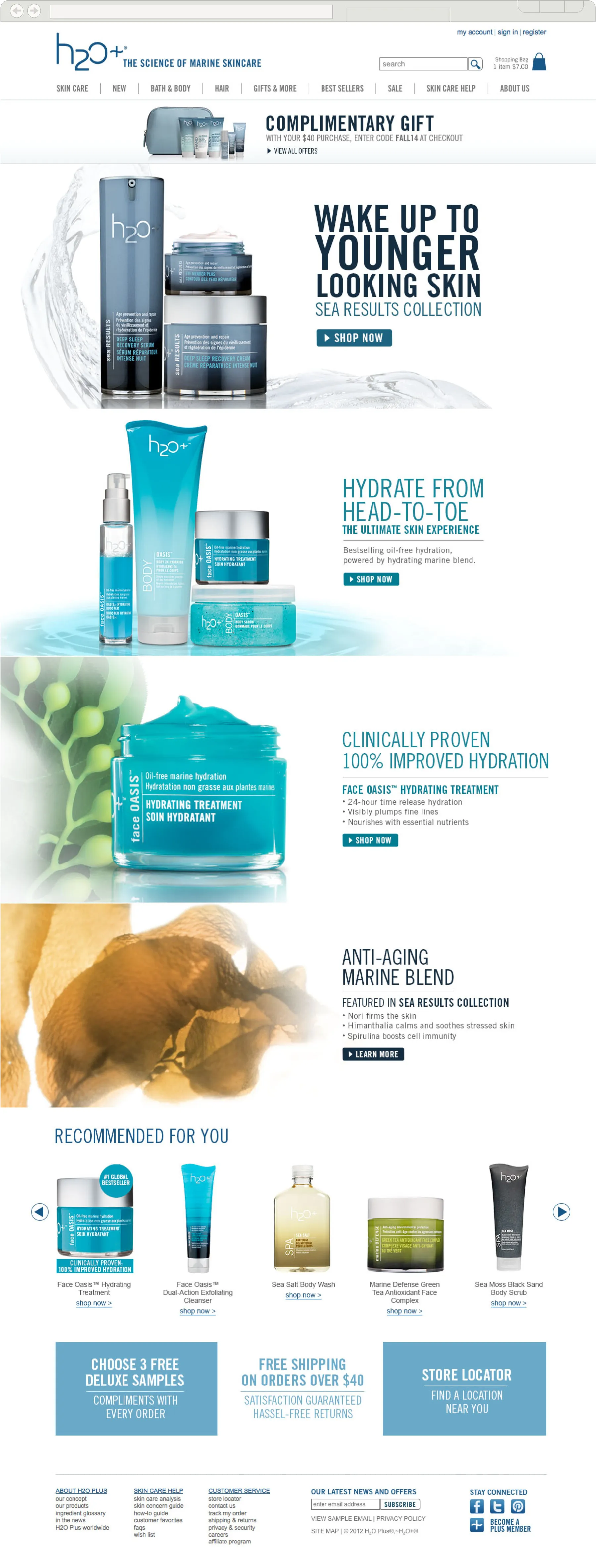
Bigger, Brighter & Clearer
The homepage focused several large dynamic visuals, bold typography and quick copy to introduce the latest promotion. Although the current platform was not responsive, I was able to make the homepage adaptive, stretching the key visuals to feel the page maximizing the impage.
In addition to cleaning up the header, a larger footer was incorporated in two parts. The first to additional offers such as free shipping and more extensive site navigation at the bottom.

#216D98
#00ACD6
#9D9C9D
#EAEAEA

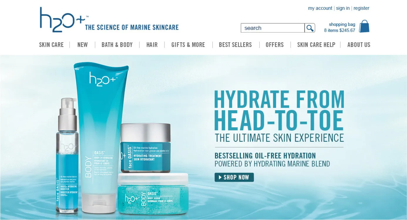
A Clean, Bold, & Clinical Look was the Focus
Changing the background to white necessitated codifying a color scheme as well establishing a typographic system with the already chose typeface Trade Gothic Condensed.
Adding a light cerulean blue and soft greys allowed for the effect of a lighter cleaners water visual. <Light, Clean, Water, Science>. Partial boarders and complementing verticle and horizontal lines instead of full border helped define discrete spaces yet keep an open look.
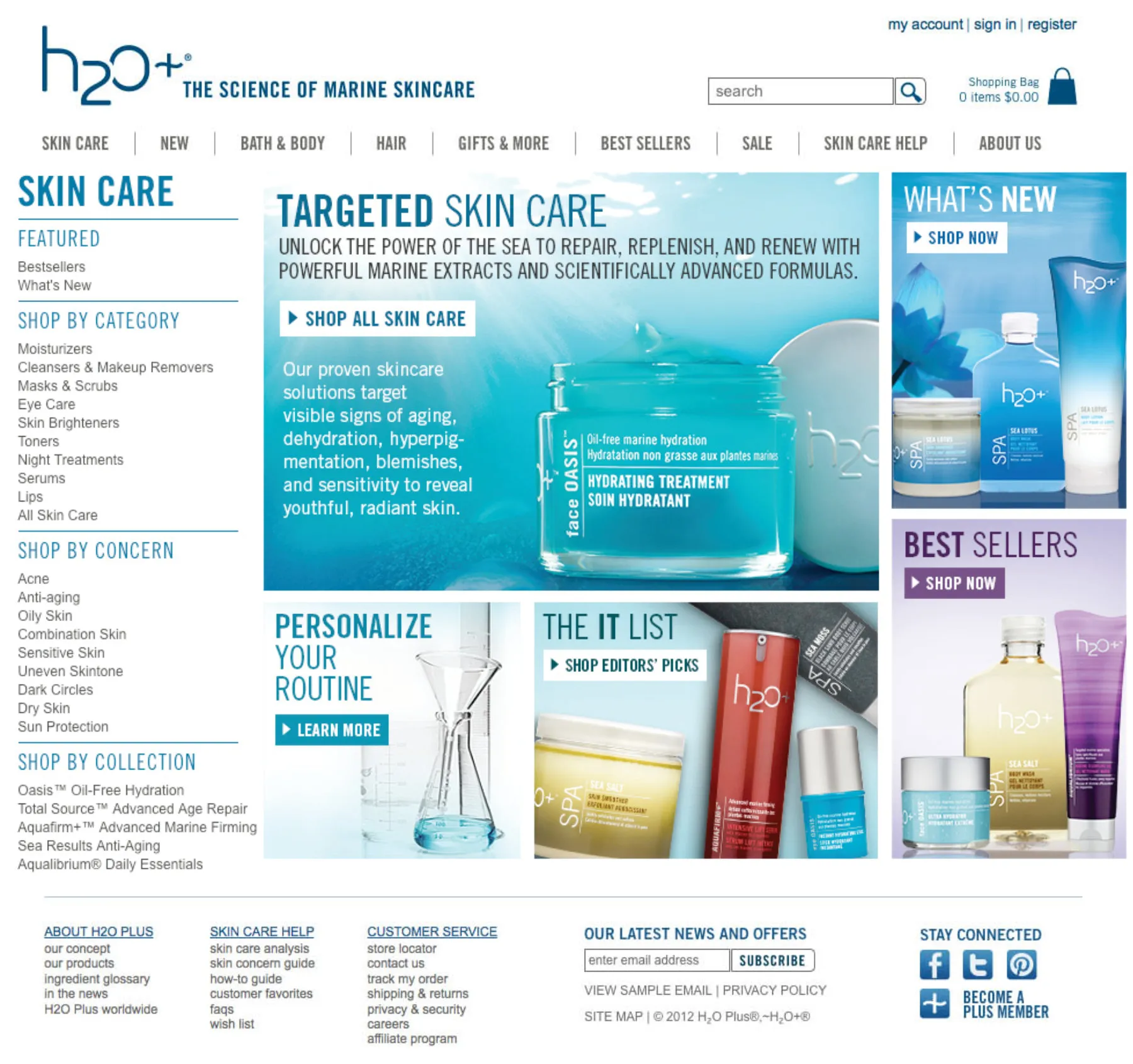
Adding a light cerulean blue and soft greys allowed for the effect of a lighter cleaners water visual. <Light, Clean, Water, Science>. Partial boarders and complementing verticle and horizontal lines instead of full border helped define discrete spaces yet keep an open look.
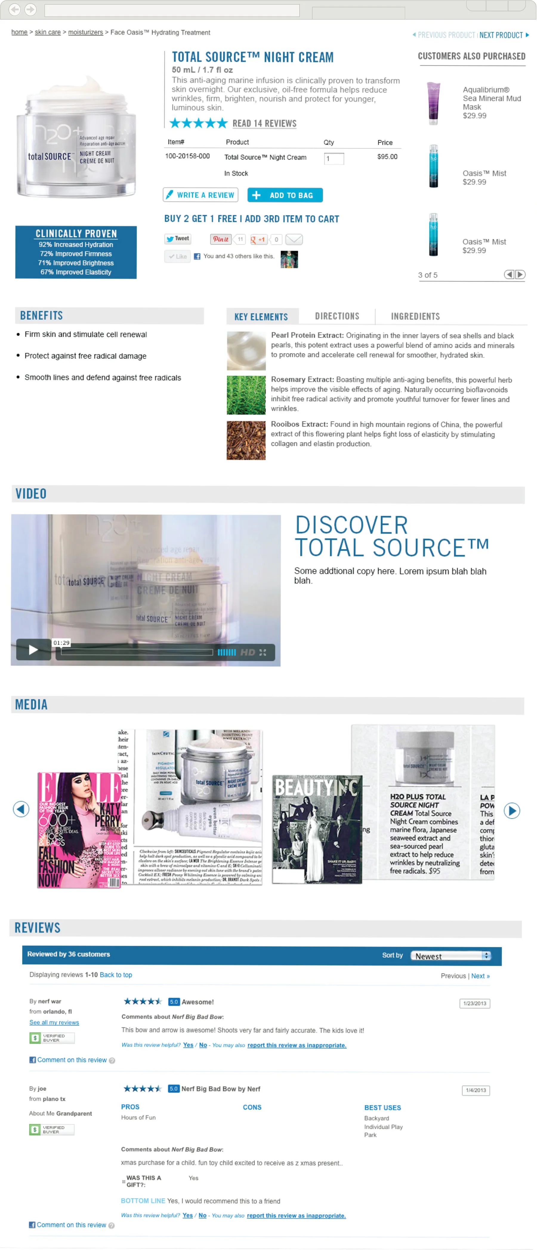
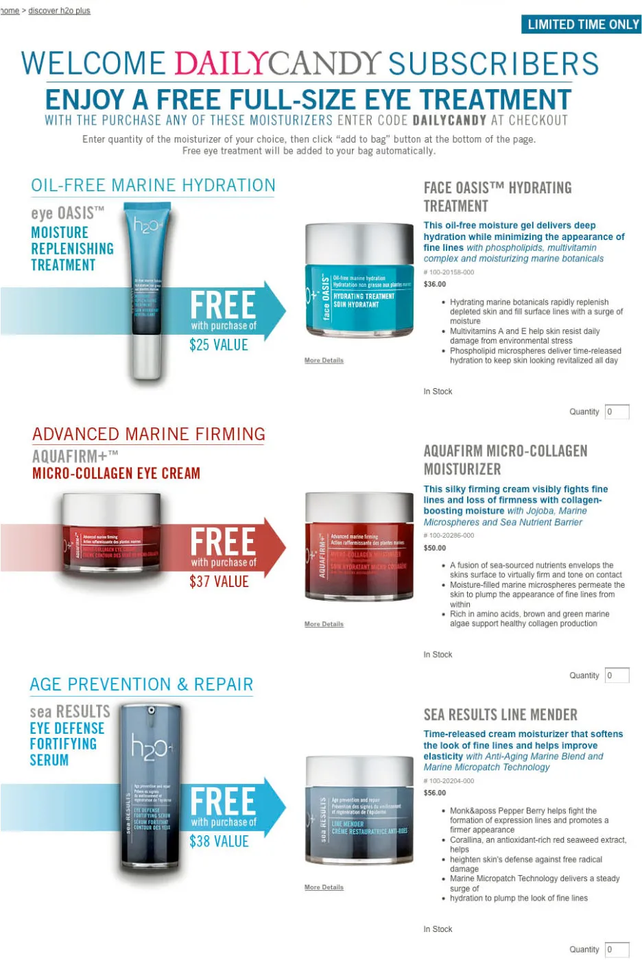
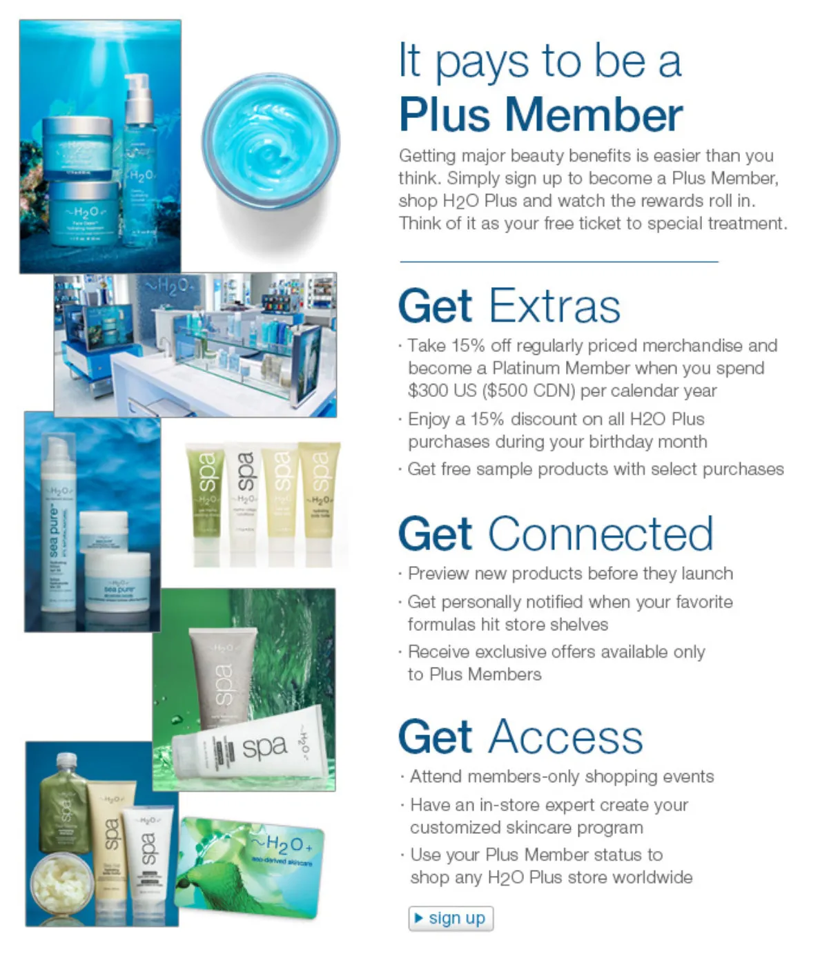
You Can Be Information Dense without Being Heavy
We did a complete overhaul of the product details page. The goal was to information dense, while remaining easy to read and still feel light.
A well established hierarchy was necessary for a road map for the page layout. Vital concise info was present above the fold. Horizontal and vertical lines where used to define separate spaces while keeping everything open. And establishing a tight typographic scale for consistency and rhythm.
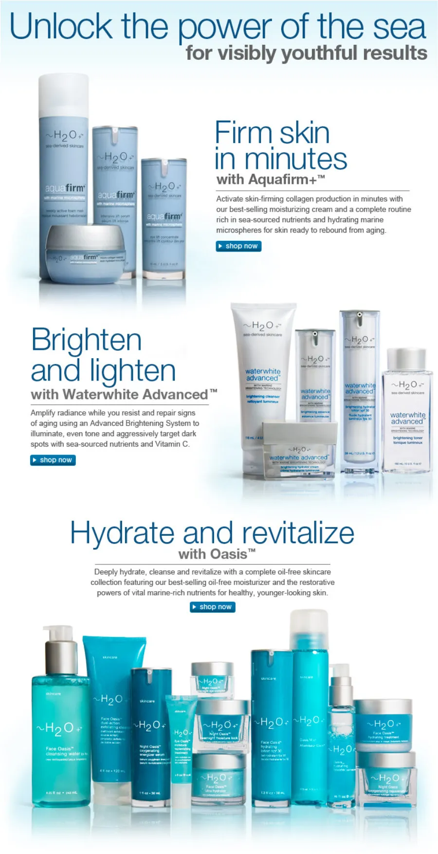
Telling the Story of the Brand in Many Different Ways
There were many opportunities to tell the story of our brand with the use of landing pages throughout the site. This was always a great opportunity to explore unique design options.
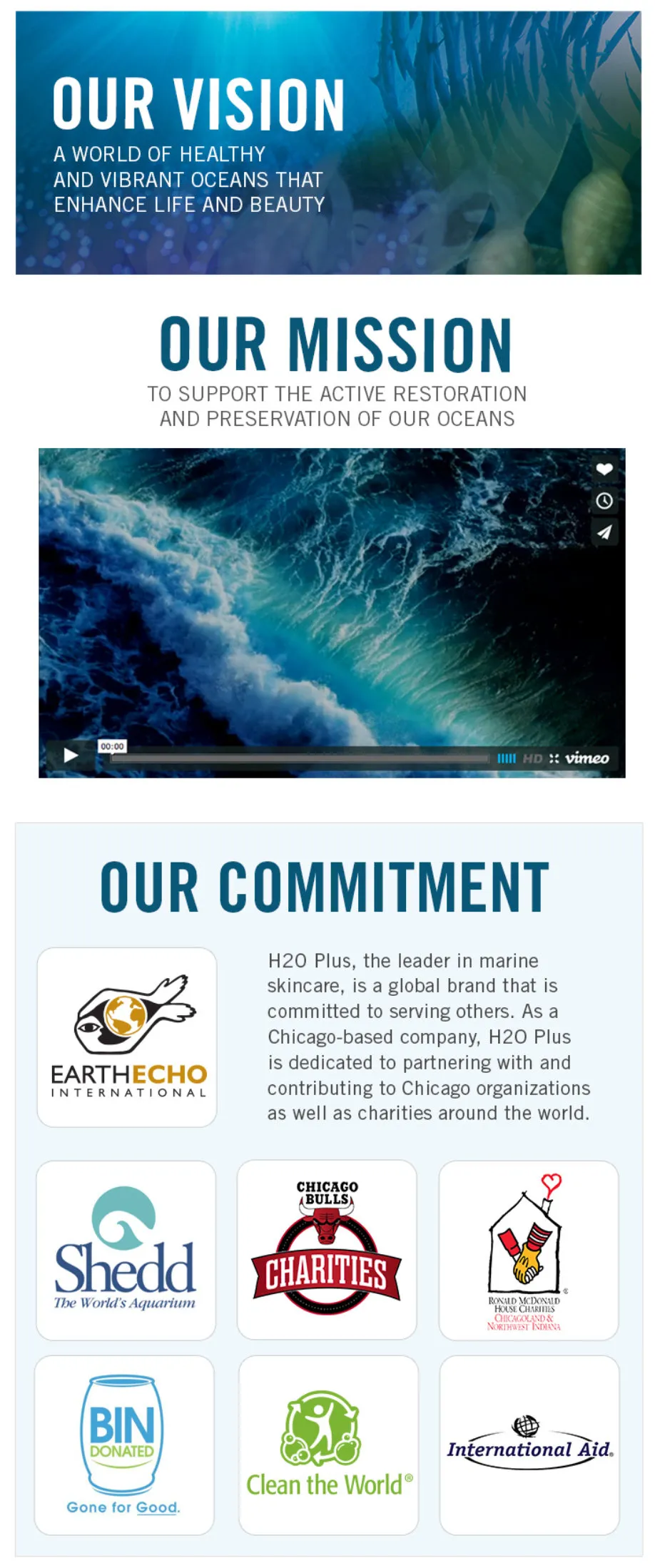
Images Anchor Design & Are the Focal Point of Storytelling
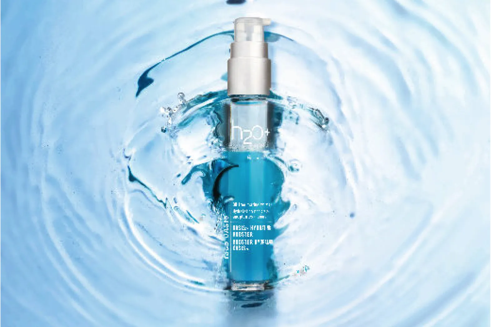
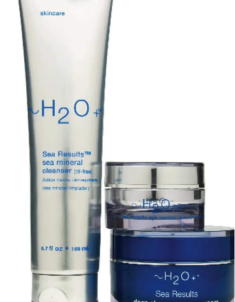
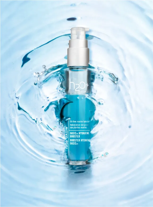
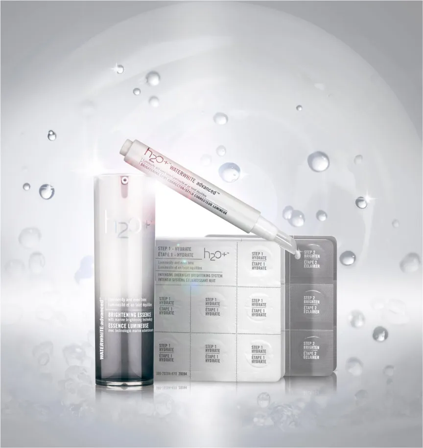
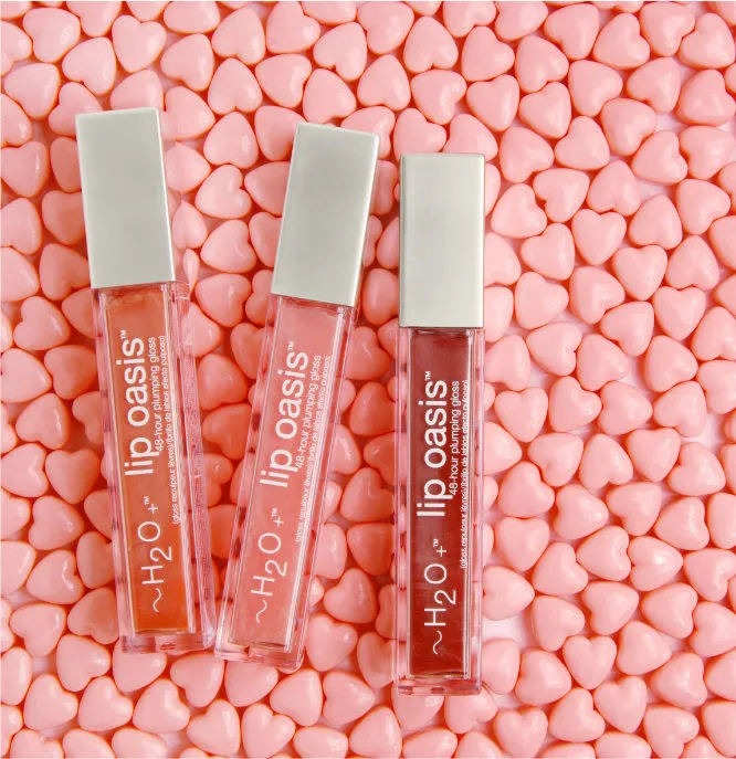
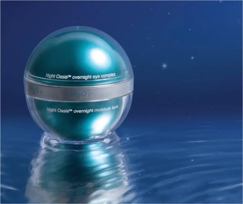
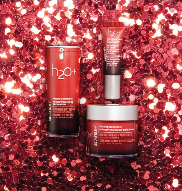
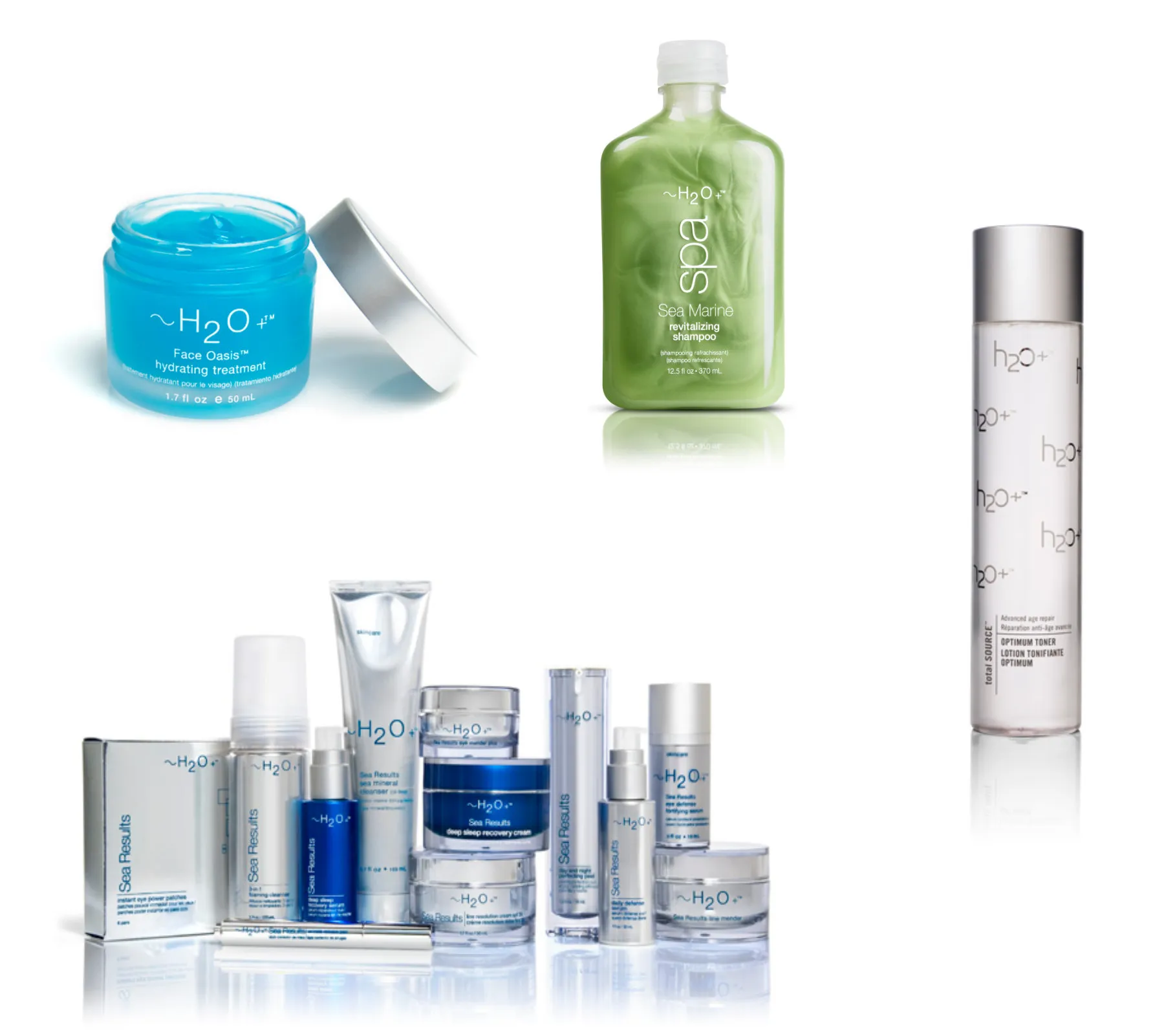
The first big impact I was able to make on h2oplus.com was to create an implement a new stanadard for product photography. Consistent high quality product photography was primary in communicating that we were a prestige brand. I undertook rephotographing the entire collection to bring all products on the site up to this standard.
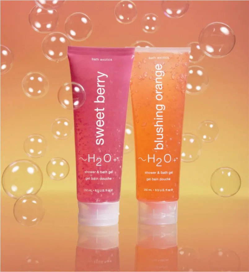
Over the years I was able to create colorful high impact story telling photos that anchored marketing promotions and brought the products to life in a new an fun way.
Over the years I was able to create colorful high impact story telling photos that anchored marketing promotions and brought the products to life in a new an fun way.
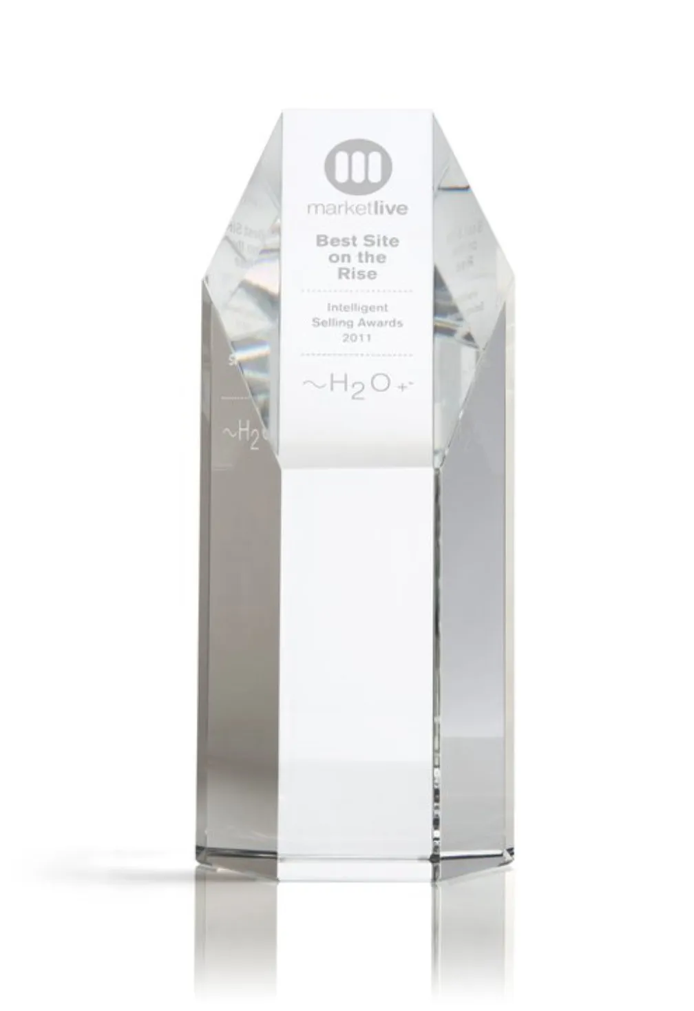
Over the years at H2O Plus I was able to continually create dymanic imagery, relevant and stunning web sites that remained relevant elevating the brand to compete with larger prestige brands. The site was recognized as MarketLive Best Site on the Rise in 2011. The quality of work helped gain venture capital and foreign investment.